CLICK HERE FOR BLOGGER TEMPLATES AND MYSPACE LAYOUTS »

Monday, September 8, 2008

final


i changed my text font because it is too hard to read..
Deforestation GAN YEE KENG
1081101296

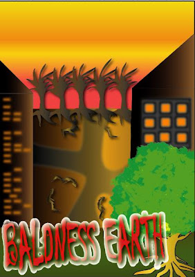
This “BALDNESS EARTH” is stand for an earth got no much trees just like a boldness guy got a little amount of tree only.

Why I used the word “baldness”, I am trying to tongue in cheek with all the humans. As we knew, a baldness guy will look no confident always and ugly all the way as our earth will being suffering, ugly and even look dying with hot temperature and lack of species of animal. They are so many things will being affected if our earth bald just likes this! Do humans enjoy living in this kind of earth? No! They hate it as how they hate themselves to have a bald head.

I hope to reflect out all of the meaning from my title and my design.
My design, all the buildings, roads trees and dead roots were all in chocolate, black and orange color. I want to give a feeling just like “DYING” and “BORED”. And the “sky” behind the “building” was showing the feeling of global warming. Representing HOT.

The whole diagram hopes to show that our earth will be bored and dead if our earth was in a hot temperature atmosphere without trees and animal.

Save our earth before it become a BALDNESS EARTH,
As we will take care for our hair before we become bald,
OUR Earth…
Was much more important!


Sunday, September 7, 2008

my aissignment three


used gradient...color to show HOT and WARM
used gradient also to show DRY and DYING


buildings
-gradient
-blur
-windows with blur effect were draw one by one and copy & paste some..
-smart guide to make my building are in standard size..


tress

-gradient

-copy and paste

-warp tool used to make all the brunches for every tree look different

-use pen tool to draw

-effect DROP SHADOW was used


road
-gradient also ^^
-radial blur to make my road more effecting
-mesh took used to put some black color


dead roots

-used to show almost all the tree had been cut down only left dead roots

-used gradient also

-and rotate tool


above and below,the tree was daw when my second assignment,

used gradient,brush ,pencil tool and pen tool.


the words is CHILLER font -

-used drop shadow effect

inner grow from stylic

-i used scale tools to make it bigger

Saturday, September 6, 2008

my references for assignment three


\

reference for my poster
i do references for fonts,tree and poster pattern..
i still thinking my idea...
processing ^^

Monday, September 1, 2008

sketching


i will add on this two image in my poster ,
i will using my second assignment,it's background and the tree...
but,its really sorry,this for days keep busyng with design fundemental..
hahaha,four days holidays used up with that....
started to do it tommorrow!!